Some samples of data collection, analysis and visualization from various projects to give a broad idea of the subject matter knowledge. Currently I am learning how to create interactive pieces on Processing.
2. Annual Report Project
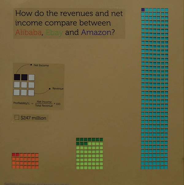
Comparing Amazon, Alibaba and Ebay using data from their annual report. The objective of the visualization was to evoke curiosity, catch attention and make the data easy to understand. For this, we used the visual language of paper cutting to create a contrast between the type of organizations chosen and the medium through which it was expressed.
Public Data Visualization:
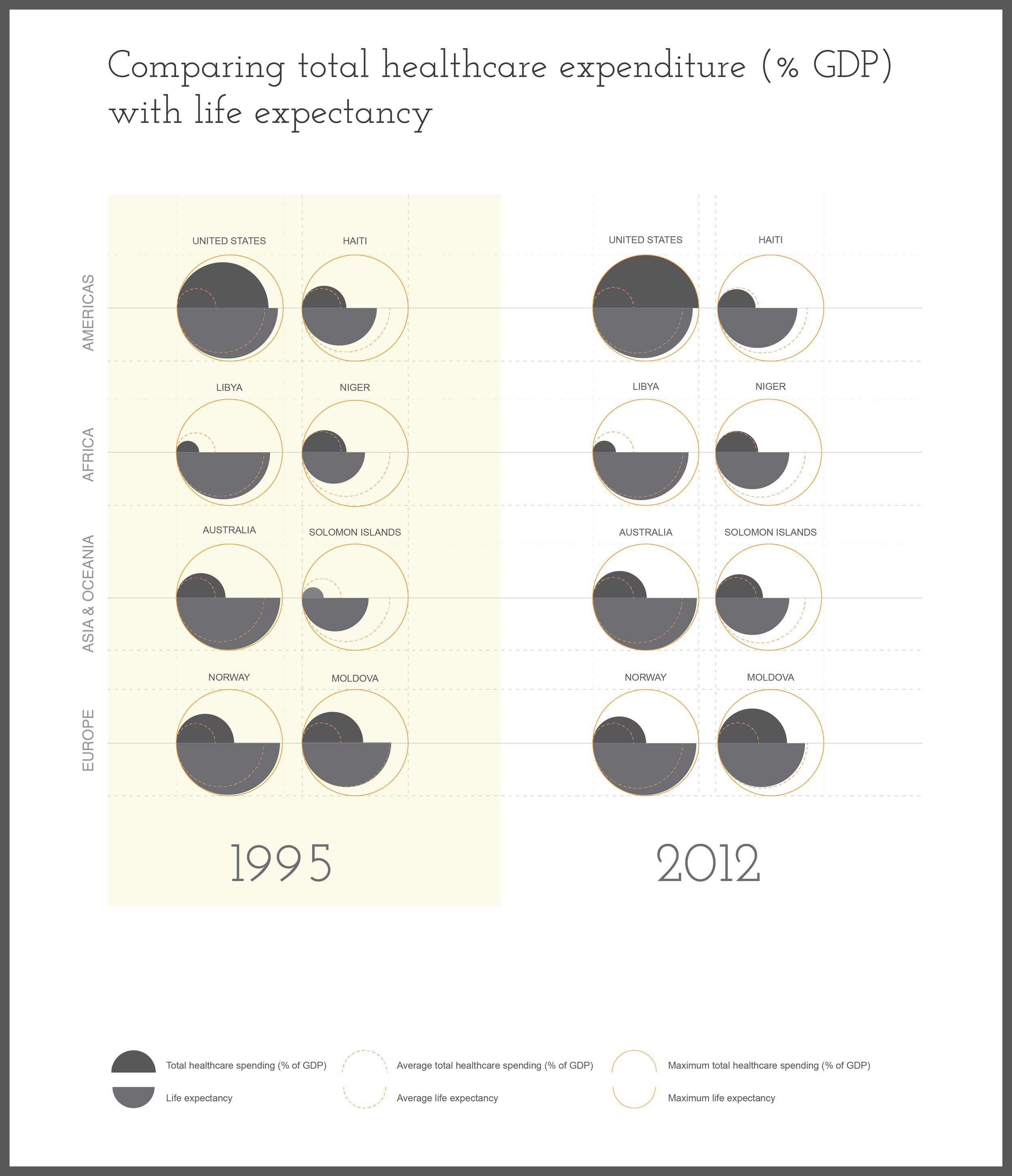
1. Comparison of Total healthcare expenditure ( % GDP) with life expectancy for 1992 and 2012 across most developed and least developed countries in the world (chosen according to Human Development Index).
The goal was to visually see at a glance if there is a correlation between high spending and high life expectancy.
a) Comparing revenue and net income between the three companies.
As we can see, the revenue for Amazon is much more higher than Alibaba or Ebay. However, the net income for Ebay is 10 times that of Amazon, and for Alibaba is twice as much as Amazon.
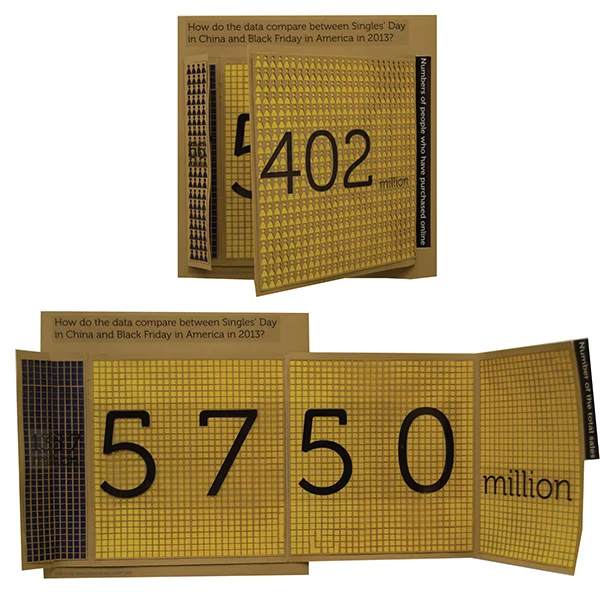
b) Singles Day versus Black Friday.
With this interactive piece, we tried to explore the idea of analogue animation.
The outer cover shows the no. of people who participated in Singles Day in China versus those who participated in Black Friday in the US.
On opening, the inside shows the Singles Day Sales in China (by Alibaba) with Black Friday in the US.
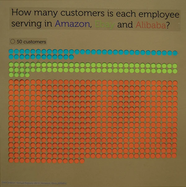
c) Customer to Employee ratio.
The no. of customers served per employee is much lesser for Amazon than Alibaba. That is one way that Alibaba keeps its expenses low.


